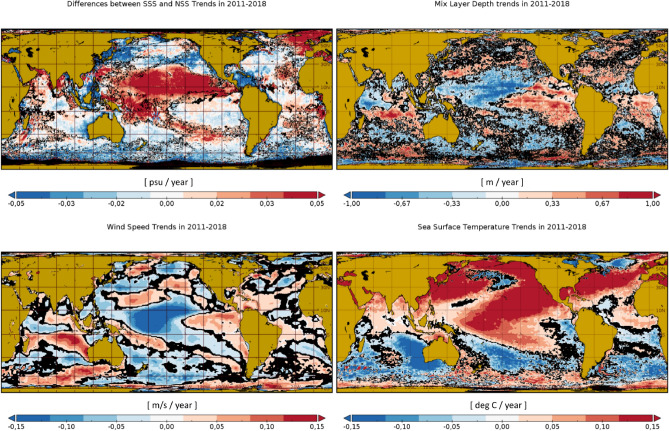
Figure 3.
Top left panel: Differences between the satellite SSS trends and the model NSS trends in 2011–2018. Top right panel: mixed layer depth trends in 2011–2018. Bottom row: wind speed trends (left) and sea surface temperature trends in the same period (right). Locations with trends being different from zero with a level of confidence are represented in black. Maps are plotted with Panoply v 4.12.0 (https://www.giss.nasa.gov/tools/panoply/).

