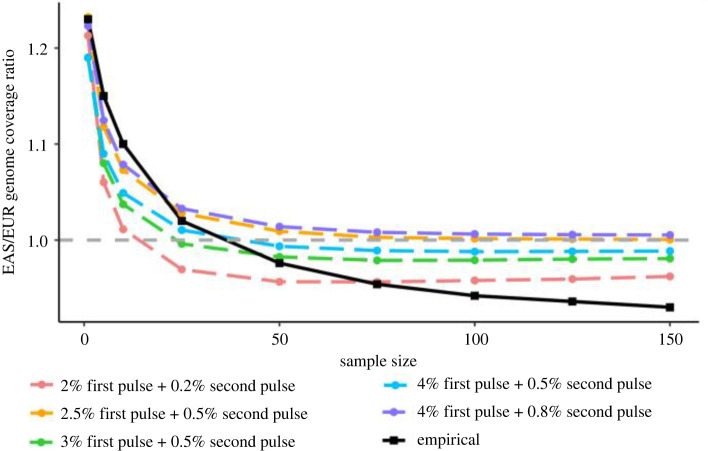
Figure 6.
A comparison of the five best-fitting demographic models (by lowest mean squared error) to the empirical data. The x-axis is the number of individuals sampled to calculate ancestry coverage, and the y-axis is the ancestry coverage found in EAS divided by the ancestry coverage found in EUR. The dashed horizontal line denotes where the ancestry coverage would be equal across both populations. The empirical mean values (from 100 sampled replicates) are in black, and the mean values (from 100 sampled replicates each of 200 simulated datasets) of the five best-fitting models with the lowest mean squared error relative to the empirical data are shown in different colours. For all models, the ‘first’ pulse represents gene flow from Neanderthals into the ancestor of East Asians and Europeans, while the ‘second’ pulse represents archaic gene flow into East Asians specifically. The full list of models, their coverage ratio values and mean squared error are available in electronic supplementary material, table S4.

