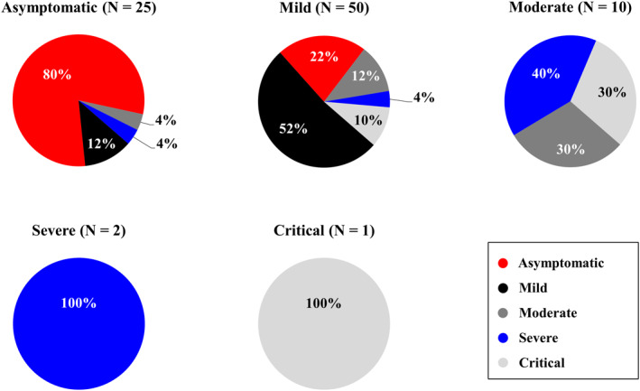
FIGURE 1.

COVID‐19 development overview from initial disease severity to the highest degree during NmAbs administration follow‐up. Figure 1 presents a total of five pie charts divided according to COVID‐19 baseline degree at the time of NmAbs administration. Percentage of COVID‐19's worst degree at follow‐up is indicated in pie chart colors (asymptomatic in red, mild in black, moderate in dark gray, severe in blue, and critical in light gray). COVID‐19, corona virus disease 2019; NmAbs, neutralizing 344 monoclonal antibodies
