. 2022 Apr 19;11:e67659. doi: 10.7554/eLife.67659

Figure 2. Temporal fluctuations in adenosine triphosphate (ATP) levels in snf1∆ adk1∆ and bas1∆ cells.

(A) Time-lapse imaging of QUEEN in wild-type cells cultured in 2% glucose medium. QUEEN ratios were converted into intracellular ATP levels in cells and plotted (right panel). (B, D) Time-lapse imaging of QUEEN in snf1∆ adk1∆ cells. Images at the representative time points were shown. The QUEEN ratio decreased twice (indicated by arrowheads) within a short interval. See also Figure 2—video 1. Data were converted into ATP levels and plotted in (D). (C, E) Another example of the time-lapse imaging of QUEEN in snf1∆ adk1∆ cells in 2% glucose medium. The QUEEN ratio decreased twice (indicated by arrowheads) with a long interval (a rare event). See also Figure 2—video 2. Data were converted into ATP levels and plotted in (E). (F) Some snf1∆ adk1∆ cells showed unstable ATP levels. Wild-type and snf1∆ adk1∆ cells were classified and scored according to the indicated ATP dynamics. Data were pooled from three independent experiments for each strain. (G) Time-lapse imaging of QUEEN in bas1∆ in 2% glucose medium. ATP levels in the mother (cell-1) and daughter (cell-2) were plotted at the bottom. Images at the representative time points were shown on the top. Note that the QUEEN ratio is synchronized until cells undergo separation at the time point of 76 min indicated by an arrow. After separation, each cell has a unique periodic cycle of ATP. The movie is available in Figure 2—video 3. White scale bar = 5 µm.

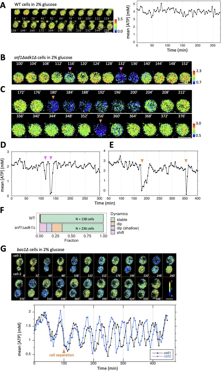
Figure 2—source data 1. Raw data for Figure 2.

Figure 2.

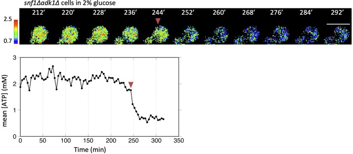
Figure 2—figure supplement 1. Time-lapse imaging of QUEEN in an snf1∆ adk1∆ cell showing the adenosine triphosphate (ATP) shift.

Figure 2—figure supplement 1.

Time-lapse imaging of QUEEN in snf1∆ adk1∆ cells in 2% glucose medium. An example of a snf1∆ adk1∆ cell showing the ATP shift, an irreversible decrease in the QUEEN ratio (indicated by an arrowhead). Images at the representative time points were shown. The ATP level was plotted at the bottom. White scale bar = 5 µm.
Figure 2—figure supplement 1—source data 1. Raw data for Figure 2—figure supplement 1.
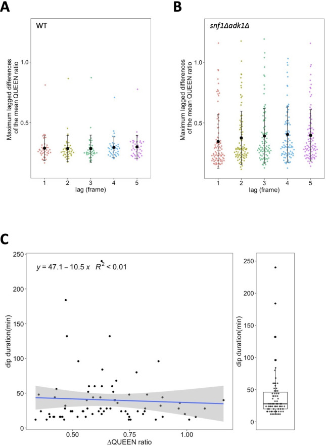
Figure 2—figure supplement 2. Temporal fluctuations in the QUEEN ratio in wild-type and snf1∆ adk1∆ cells.

Figure 2—figure supplement 2.

(A, B) Maximum lagged differences in the mean QUEEN ratio in a cell in single time-course data were plotted versus the lag. Time course data from 39 wild-type (A) cells and 88 snf1∆ adk1∆ (B) cells were used for calculations. Black dots and whiskers indicate the mean ± 1SD. See Materials and methods for more details about the calculation. (C) Scatter plot between the maximum amounts of decreases in the QUEEN ratio during the adenosine triphosphate (ATP) dip and the dip duration (N = 75). A blue line and gray shaded area indicate the linear regression line and the 95% confidence interval, respectively. Dip durations were also box plotted in the right.
Figure 2—figure supplement 2—source data 1. Raw data for Figure 2—figure supplement 2.
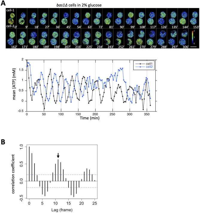
Figure 2—figure supplement 3. Oscillatory behavior of the adenosine triphosphate (ATP) level visualized in bas1∆ cells.

Figure 2—figure supplement 3.

(A) Another example of bas1∆ cells showing an oscillating QUEEN ratio. In this case, cytokinesis had just been completed at t = 0 min. ATP levels in cell-1 and cell-2 were plotted at the bottom. See also Figure 2—video 4. White scale bar = 5 µm. (B) Autocorrelation function of the QUEEN ratio calculated from the data on cell-1 in Figure 2G. Blue dotted lines indicate the 95% confidence interval. An arrow indicates the second peak of the correlation and corresponds to the apparent period.
Figure 2—figure supplement 3—source data 1. Raw data for Figure 2—figure supplement 3.
Figure 2—video 1. Time-lapse imaging of QUEEN in snf1∆ adk1∆ cells in 2% glucose medium.
Download video file (100.1KB, mp4)
Corresponding to the data shown in Figure 2B. The QUEEN ratio decreased twice (116 and 132 min) within a short interval. White scale bar = 5 µm.
Figure 2—video 2. Another example of snf1∆ adk1∆ cells showing a sudden decrease in the QUEEN ratio.
Download video file (133.6KB, mp4)
Corresponding to the data shown in Figure 2C. The QUEEN ratio decreased twice (180 and 356 min) with a long interval. White scale bar = 5 µm.
Figure 2—video 3. Oscillatory behavior of the QUEEN ratio in bas1∆ cells.
Download video file (345.3KB, mp4)
Corresponding to the data shown in Figure 2G. Left, the QUEEN ratio image; middle, Myo1-mCherry (inverted grayscale image); right, bright-field image. Images were taken every 4 min. White scale bar = 5 µm.
Figure 2—video 4. Another example of bas1∆ cells showing an oscillating QUEEN ratio.
Download video file (223.9KB, mp4)
Corresponding to the data shown in Figure 2—figure supplement 3A. Left, the QUEEN ratio image; right, bright-field image. In this case, cytokinesis had already been completed at t = 0 min. Images were taken every 3 min. White scale bar = 5 µm.