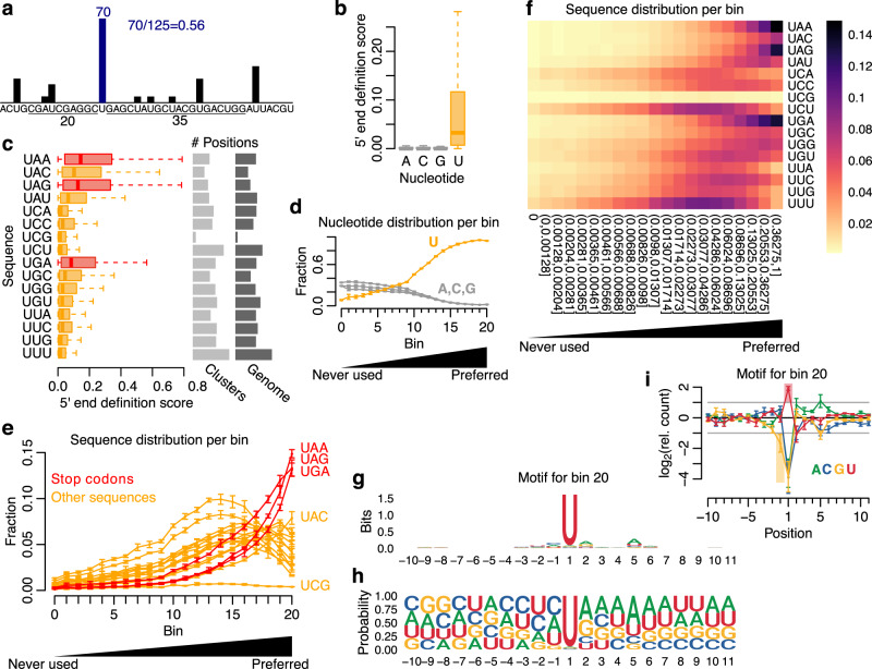
Fig. 4. Deciphering the cleavage preference of PLD6.
a Illustration of the 5′ end definition score. b Boxplot showing 5′ end definition score per nucleotide using pooled data (5 replicates). c Boxplot showing 5′ end definition score per Unn sequence. Stop codons are shown in red and the remaining sequences in orange. The number of positions per sequence is shown to the right. The data were pooled (5 replicates). d Line graph showing nucleotide fraction per bin. Fraction shown as mean ±sd (5 replicates). e Line graph showing Unn sequence fraction per bin. Fraction shown as mean ±sd (5 replicates). f Heatmap showing 5′ end sequence distribution per bin. The 5′ end definition score thresholds are shown under each column. Fraction calculated as mean across 5 replicates. An extended figure with all sequences is available as Supplementary Fig. 5a. g Sequence motif around positions from bin 20 (pooled signal, 5 replicates). h Nucleotide frequency around positions from bin 20 (pooled signal, 5 replicates). i Nucleotide enrichment around positions from bin 20 (pooled signal ±sd, 5 replicates). An extended figure with all bins is available as Supplementary Fig. 5b. Boxplots show median (central line), interquartile range (IQR, box), and minimum and maximum values (whiskers, at most 1.5*IQR). Additional analyses using a second dataset are available in Supplementary Fig. 6 and Supplementary Fig. 7. Source data are provided as a Source Data file.

