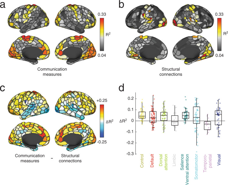
Fig. 4. Comparison of communication measures and structural connectivity in predicting FC.
In the main text we derived a series of communication measures from sparse structural connectivity (SC) data to predict regional FC patterns. Here, we compare the results from the communication measures with the results obtained from using the structural connections directly. In this analysis, we create a “mask” for each region and subject of its structural connections to other regions. We then extract the weights of those structural and functional connections and fit a linear model to explain the functional connection weights in terms of the structural weights. This results in an R2 value for each region and subject. a Variance explained using communication measures averaged across subjects. b Variance explained using structural connections alone averaged across subjects. c Regional differences in variance explained. Warmer and cooler colors indicate regions whose FC is better predicted using the communication measures and structural connectivity, respectively. d Data from panel c but displayed by brain system. Each point represents a brain region (N = 400 parcels defined based on40). In each boxplot, the “box” denotes interquartile range (IQR), the horizontal bar indicates the median value, and the whiskers include points that are within 1.5 × IQR of upper and lower bounds of the IQR (25th and 7th percentiles). Any points that fall beyond the whiskers are, by convention, considered outliers. Source data are provided as a Source Data file.

