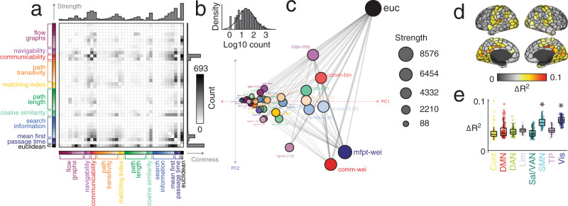
Fig. 5. Pairwise synergies between predictors.
We used two-predictor multi-linear models to predict regional patterns of FC and identified the optimal pair of predictors for each region and each subject. We then counted how frequently each pair of predictors appeared in the set of optimal predictors. This procedure yields a symmetric matrix of counts (a). The counts were approximately log-normally distributed (b). The matrix could be modeled as a graph and each node’s (predictor’s) coreness could be directly calculated (node positions based on principal components analysis of count matrix) (c). In this plot, coordinates were determined by: 1) thresholding the count matrix to retain, for each predictor, its k = 4 nearest neighbors, and 2) performing a principal component analysis on the thresholded and symmetrized matrix. Here, the coordinates represent the first two principal components, PC1 and PC2. Predictors that are near/distant from one another in principal components space pair with similar/dissimilar sets of predictors when improving R2. Predictors are joined by an edge if they are considered nearest neighbors. As in Fig. 2b, we did not center or z-score columns as part of the principal component analysis. We also calculated the mean regional improvement in R2 from using the multi-linear model versus the model with a single predictor. Each point represents a brain region (N = 400 parcels defined based on40). d Improvement (ΔR2) projected onto the cortical surface. e Improvement grouped by canonical brain systems (asterisks indicate statistical significance). In each boxplot, the “box” denotes interquartile range (IQR), the horizontal bar indicates the median value, and the whiskers include points that are within 1.5 × IQR of upper and lower bounds of the IQR (25th and 7th percentiles). Any points that fall beyond the whiskers are, by convention, considered outliers. Source data are provided as a Source Data file.

