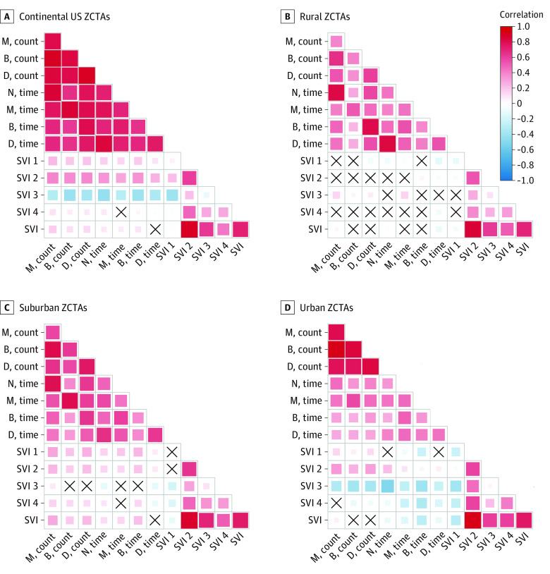
Figure 3. Correlation Between Zip Code Social Vulnerability Index and Geographic Access to Methadone (M), Buprenorphine (B), Dialysis (D), and Extended-Release Naltrexone (N) Treatment Within the Continental United States in 2020.
The shading is representative of the magnitude of Spearman rank correlation, with red indicating positive correlations and blue indicating negative correlations. We reversed the direction of all count access metrics so that the directions of correlations are aligned. For correlations between access metrics and social vulnerability index (SVI) scores, positive correlations (in red) indicate more vulnerable zip code tabulation areas (ZCTAs) have worse accessibility (ie, fewer resources or longer drive time), while negative correlations (in blue) indicate more vulnerable zip code areas have better accessibility (ie, more resources or shorter drive time). Boxes marked with an X represents no correlation.

