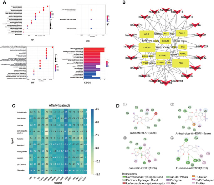
Figure 3.
GO biological process and KEGG pathway enrichment analysis, and molecular docking of core compounds and core target genes. (A) The abscissa of the GO biological process bubble chart represents the proportion of genes, and the ordinate represents the names of enriched biological processes, cell components, and molecular functions, respectively. The bubble size represents the proportion of genes on each biological process. The larger the bubble, the more genes are enriched. The horizontal axis of the KEGG pathway bubble chart represents the proportion of the pathway in the total pathway, and the vertical axis represents the pathway name. The bar length represents the proportion of genes on each pathway. The longer the bar, the more genes are enriched. The color represents the degree of enrichment. And the closer the color is to red, the more significant the enrichment is. (B) KEGG relationship network construction. In the KEGG relationship network diagram, the red arrows represent pathways, the yellow rectangles represent genes, and the links represent the relationship between pathways and genes. The larger the red arrow, the greater the number of genes enriched in the pathway. Similarly, the larger the yellow rectangle, the more pathways connected to the gene. (C) The abscissa represents the core gene, and the ordinate represents the core compound. The numbers in the box represent the docking affinity score. The grading color scale ranges from blue to yellow. The closer the color is to yellow, the lower the affinity score is and the stronger the binding is. (D) The figure is the two-dimensional structure diagram of ligand and receptor interaction. Different color represents different interaction.

