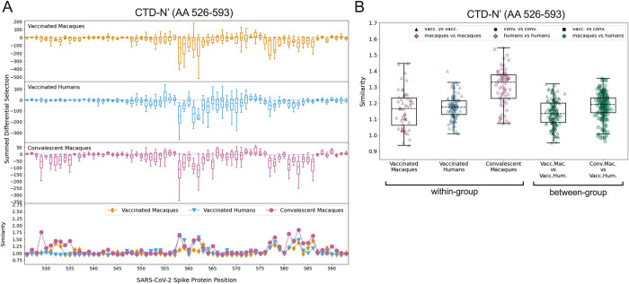
Fig 3. Comparison of escape profiles in the CTD-N’.
(A) The top three panels show boxplots depicting the summed differential selection values of all individuals in a group at each locus, with each data point representing a different individual. The box represents median and interquartile range (IQR), the lower whisker represents the lowest data point above Q1-1.5IQR, and the upper whisker represents the highest data point below Q3+1.5IQR. Negative values represent sites where the binding interaction between antibody and peptide was weakened when peptides were mutated, whereas positive values represent enhanced binding. The bottom panel shows the mean escape similarity score for all pairwise comparisons between samples in each group, calculated at every locus. See S4 Fig for a description of the escape similarity score algorithm. (B) Within- and between-group region-wide escape similarity scores, with each point representing a pairwise comparison between two samples. The box represents median and interquartile range (IQR), the lower whisker represents the lowest data point above Q1-1.5IQR, and the upper whisker represents the highest data point below Q3+1.5IQR. The contribution of a site’s score to the total escape similarity score is weighted based on its relative contribution to the summed differential selection values across the region. P values are not computed due to lack of independence between data points.

