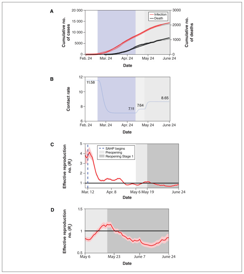
Figure 2:
SARS-CoV-2 cumulative incidence and deaths, and transmission over time. (A) Data fitting of SARS-CoV-2 infection in Toronto from Feb. 24 to June 13, 2020. The red circles (infection) and black asterisks (death) represent observed data. The grey circles (infection) and grey asterisks (death) represent data validation from June 14 to June 24. The solid curves are model simulations. (B) Changes in contact rates over time. Panels C and D show estimates of the daily effective reproduction number (Rt) of SARS-CoV-2 over time based on the episode date (C) from Mar. 8 to May 6 and (D) from May 6 to June 24, with 95% confidence intervals represented by the pink shaded area. The dark solid line indicates the critical threshold of Rt = 1. The blue dashed line represents the start of the stay-at-home policy. Shaded bars show the dates of implementation of the stay-at-home policy (light blue), preopening (light grey) and reopening Stage 1 (medium grey). The white in panels A and B represent the time period without any public health control measures. The white in panel C represents the time period before and after the implementation of stay-at-home policy. All dates are in 2020. Note: SAHP = stay-at-home policy.

