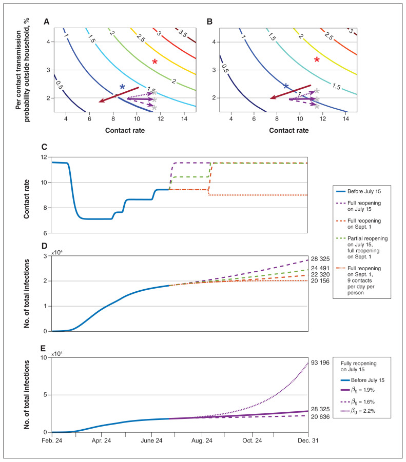
Figure 4:
Risk of reopening under different reopening scenarios. Contour plot of Rreopen with different per-contact transmission probability outside the household (βnq) and contact rate under completion ratio of symptomatic diagnosis is (A) 40%; (B) 97%. The red asterisk is the initial status of βnq and contact rate, and the blue asterisk is the state on June 24. The grey asterisk is the possible state after completely reopening in simulation E. The red arrow shows the low-risk direction with the safe reopening. (C) The change in contact rates and (D) cumulative infections over time with different reopening scenarios: fully reopening on July 15 (purple dashed line), partially reopening on July 15 and then fully reopening on Sept. 1 (green dashed line), fully reopening on Sept. 1 (orange dashed line), fully reopening on Sept. 1 while maintaining a contact rate of 9 (orange dotted line), while βnq is 1.9%. (E) The number of cumulative infections over time with βnq = 1.6% (dashed line), 1.9% (solid line, current state), 2.2% (dotted line) when fully reopening on July 15. Rreopen = the transmission risk after fully reopening. All dates are in 2020.

