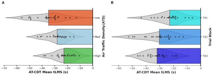
Figure 10.
Horizontal bar graph with violin plots showing the distribution of mean Air Traffic Conflict Detection Task (AT-CDT) time to loss of minimum separation (tLMS) values obtained from each participant under (A) each air traffic density (ATD) condition and within (B) each trial block (TB). Longer bars represent faster responses associated with quicker detections of conflicts. Each error bar represents ± 1 SE. Zero on the x-axis marks the time-point at which a conflict event occurs. The violin plot overlaid on each bar represents the probability density function (PDF) of the data distribution falling within (A) each ATD condition and (B) TB. Each PDF was mirrored along the central horizontal axis of each bar. There was no prominent skewness in data distribution in any ATD condition or TB.

