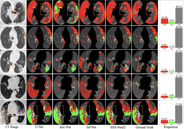
Fig. 7.
Visual comparison of multi-class infection segmentation results, where the red and green labels denote the GGO and consolidation, respectively. The first three examples are from , while the rest two are from . Besides, the bar charts in the last column are the proportional distributions of different categories, where the red, green and gray columns represent the GGO, consolidation and uninfected lung area, respectively.

