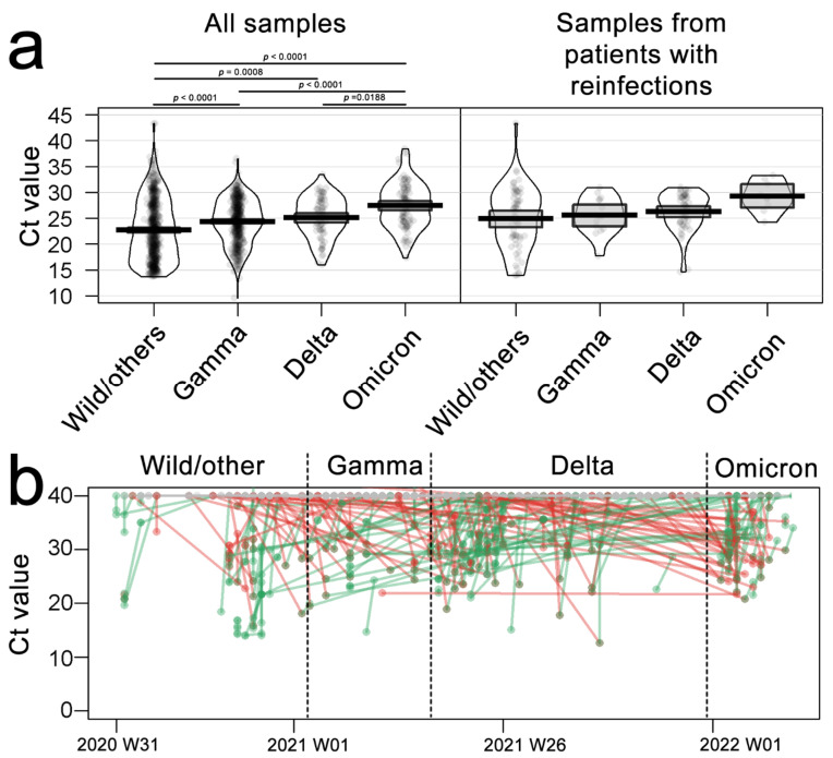
Figure 3.
Cycle-threshold values for N gene target SARS-CoV 2 detection. (a) Ct values of diagnosis for each evaluated variant during the pandemic in all samples (left) or patients with multiple collections and reinfections. (b) Dots and lines plot represent Ct values for each patient tracked for multiple infections, gray lines represent negative results from the same patient, red lines represent Ct decrease (an increase in viral load), and green lines represent Ct increase (decrease in viral load). p-values derived from ANOVA, followed by Tukey’s test. Each dot represents a sample, the box represents the interquartile range, and the lines are the kernel-smoothed distribution.

