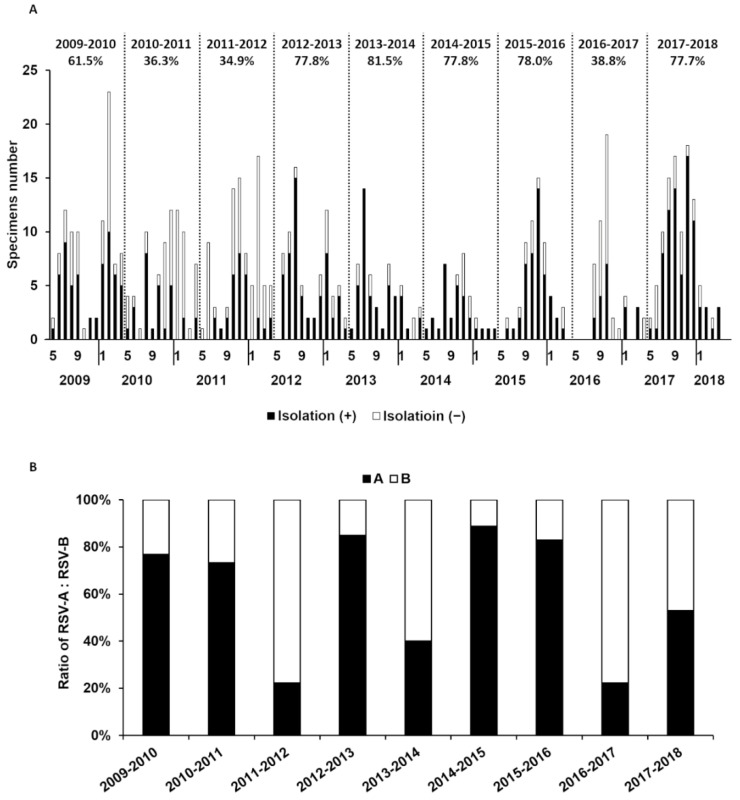
Figure 1.
Yearly changes in RSV isolation rate for 10 years from 2009 with prevalent subgroups. (A) The isolation rate of RSV in each epidemic season was calculated and is shown above the graph. The isolation rate is expressed as the number of isolation-positive specimens divided by all RSV- antigen-positive specimens. Solid and open bars indicate isolated and non-isolated sample numbers, respectively. (B) RSV subgroups were detected by RT-LAMP method. Ratios of solid bars and open bars indicate the percentage of the subgroups.

