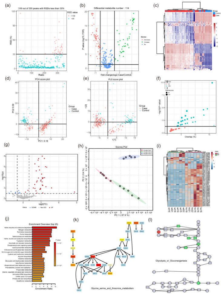
Figure 2.
Some graphical visualization features of MetFlow and MetaboAnalyst 5.0. (a) RSD (relative standard deviation) plot in the data processing function of MetFlow. Features with a high percent RSD should be removed from the subsequent analysis (the suggested threshold is 20% for LC-MS and 30% for GC-MS). (b) Volcano plot and (c) heatmap of the differential metabolites in the statistical analysis function of MetFlow, the thresholds can be set autonomously by the submitter. (d) PCA analysis and (e) PLS analysis in MetFlow. (f) Pathway enrichment overview in MetFlow, each circle represents a different pathway. Circle size and color are based on the pathway size and p-value. (g) Volcano plot of the differential analysis in MetaboAnalyst 5.0. (h) PCA analysis plot in MetaboAnalyst 5.0. (i) Heatmap shows the differential metabolites in the statistical analysis function of MetaboAnalyst 5.0. (j) Pathway enrichment overview in MetaboAnalyst 5.0. Color shade is based on the p-value. (k) The demo-enriched metabolism pathway in MetaboAnalyst 5.0. Light blue indicates that it is not an uploaded metabolite, but instead was used as background for enrichment analysis. Red indicates the metabolite is in the uploaded data and represents the different level. (l) An example of joint pathway analysis in MetaboAnalyst 5.0. By uploading candidate genes and metabolites, the corresponding pathway view is generated. Squares represent genes and circles represent metabolites. Red and green indicate the different levels. All images were obtained using the example data provided by the software.

