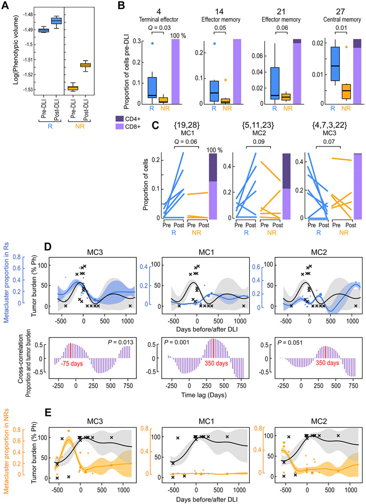
Figure. 2. Identification of outcome-associated transcriptional states and their temporal dynamics.
(A) Phenotypic volume in log-scale (metric of transcriptional diversity (Azizi et al., 2018)) of T cells before and after DLI in n=6 responders (R) and n=5 non-responders (NR). Box plot elements display the center line as median; box limits as first and third quartiles; (B-C) Proportion of T cells for pre-DLI only (B) or paired pre-/post-DLI (C) samples from n=6 Rs and n=5 NRs assigned to the indicated cluster or meta-cluster. Q-values determined from weighted t-test and empirical FDR estimation. Box plot elements display the center line as median; box limits as first and third quartiles; whiskers extend to maximum/minimum data points (A) or 1.5x interquartile range with points as outliers (B). Each line in (C) indicates one patient. Stacked bars on the right indicate the proportion of CD4+ and CD8+ T cells. (D-E) Hierarchical GP regression models (STAR Methods; Figure S3D,E; Figure S6E,F) for both the proportion of the indicated meta-cluster (in blue dots for Rs and in orange dots for NRs) and the percentage of tumor burden (in grey crosses) (indicated by percent positivity of the Philadelphia chromosome) per longitudinal samples from n=6 Rs (D) or n=6 NRs (E). Each dot is one sample and dot size is proportional to sample size (total cells); inferred model mean is shown with lines and shaded area shows +/−1 standard deviation (SD). Cross-correlation plots (D; purple) indicate the time shift between the models for meta-cluster proportion and tumor percentage, showing in-sync dynamics for MC3 and tumor (left) and a lag between MC1/MC2 and tumor (middle, right). See also Figures S3 and S6.

