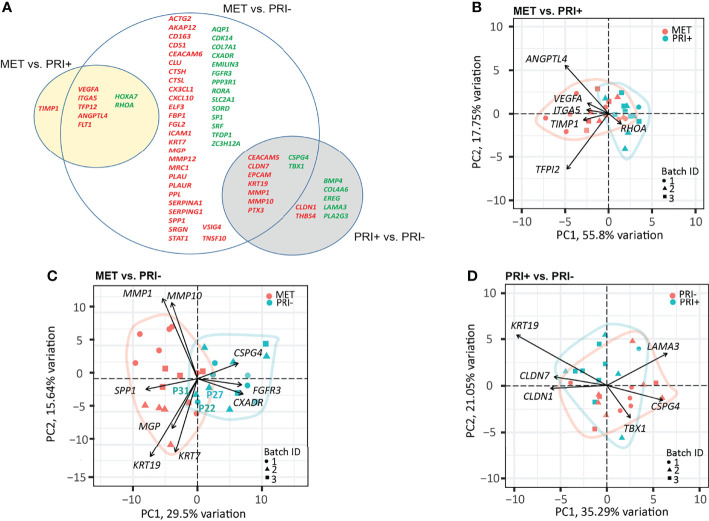
Figure 3.
Cancer progression gene panel differential expression analysis between tumor cohorts. (A) Venn diagram depicting DEGs with log2 fold change ≥1 or ≤-1 between MET vs. PRI+ and MET vs. PRI- (adjusted p-values <0.05), and PRI+ vs. PRI- (p-values <0.01). Upregulated (red) and downregulated (green) DEGs for each pairwise comparison are indicated. The overlap between the circles show DEGs genes that occur in more than one comparison. (B–D) PCA loading plots based on significant DEGs between (B) MET and PRI+ (8), (C) MET and PRI- (54), and (D) PRI+ and PRI (16). Each symbol corresponds to one sample. Ellipses represent the region where the majority of samples are expected to fall. Non-overlapping ellipses imply that gene expression profiles cluster groups apart based on their distinct principal component scores. Batch ID symbols indicate samples analyzed in different NanoString runs and show lack of batch effect.

