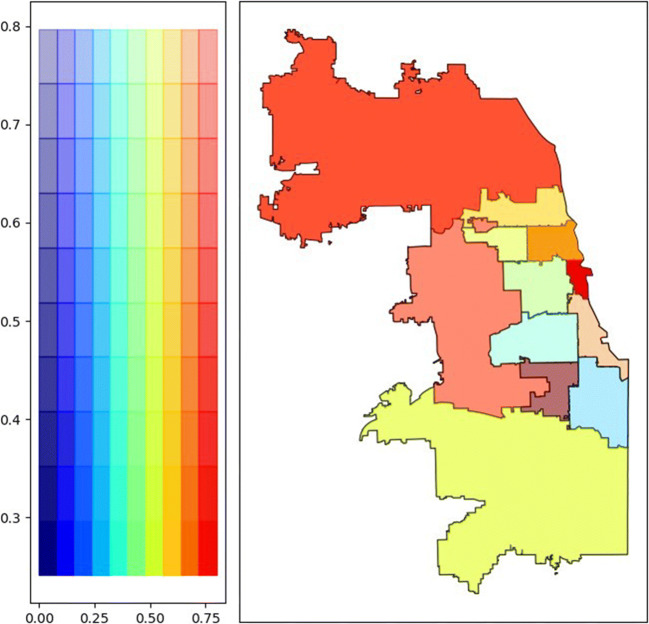
Figure 3.
Healthcare system monoclonal antibody delivery and CDC/ATSDR Social Vulnerability Index. Bivariate chloropleth map of monoclonal antibody delivery and SVI by region. Legend (left) ascribes heat map color scales to the monoclonal antibody delivery rate (X-axis) and SVI score (Y-axis). Regions with the highest delivery rates and lowest social vulnerability are shown in dark red and regions with the lowest delivery rates and highest social vulnerability in light blue.

