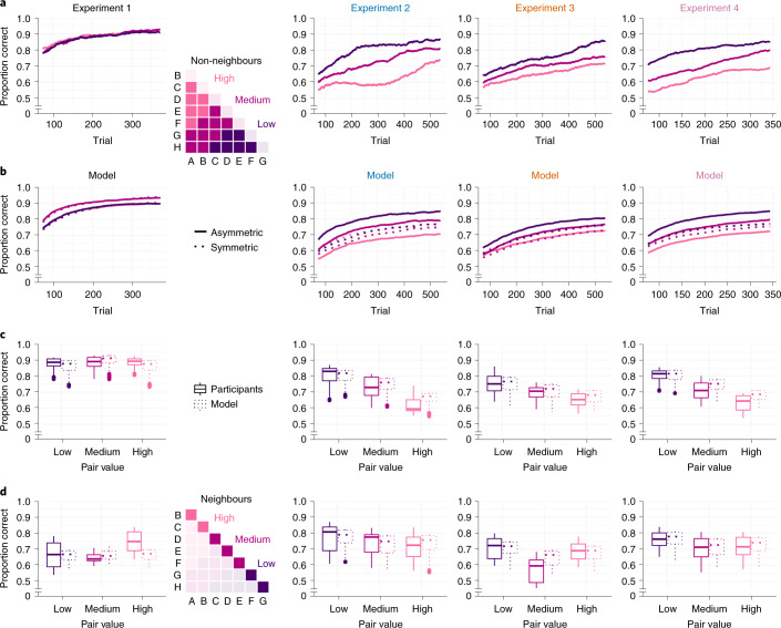
Fig. 4. Learning curves and signatures of asymmetric learning.
a,b, Learning of non-neighbour comparisons over time. Mean proportions of correct choices were calculated from a sliding window of 150 trials (a). Trajectories are shown separately for low-, medium- and high-valued pairs (see the inset matrix). In b, simulated learning curves using the best-fitting model in each experiment (Fig. 3c,d) are shown. The solid lines indicate the best-fitting asymmetric model; the dashed lines indicate the corresponding symmetric model with α+ = α−. Asymmetric learning in Exps. 2–4 is characterized by systematic performance differences (low > medium > high), as predicted by value compression (Fig. 2f) early on in each experiment. c, Box plot summary of the results in a and b, averaged over all trials. In each plot, the centre line indicates the median, the box limits indicate the upper and lower quartiles, the whiskers indicate 1.5× the interquartile range, and the points indicate outliers. For Exp. 1, n = 17; for Exp. 2, n = 31; for Exp. 3, n = 48; and for Exp. 4, n = 49. d, Same as c, for neighbouring item pairs.

