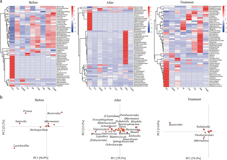
FIG 4.
Identification of biomarkers between different groups. (a) Heat map of genus-level microbial composition for species clustering. Sorted by the average abundance of the species in the group; the red color block indicates that the genus is more abundant in the group than the other genera, and the blue color block indicates that the genus is less abundant in the group than the other genera. (b) PCA species load diagram. Each point represents a species at the genus level. The abscissa and ordinate of the point can be considered the contribution of the species to the difference in the two dimensions of the group. The percentages in parentheses on the two coordinate axes are the ratio of the differences in the abundance composition of all samples in this dimension to the total differences. The contribution of the species to the difference in composition between the groups is proportional to the sum of the distances to the coordinate axis. The color from yellow to red indicates its value from small to large. Each point on the right represents a sample. Different-colored points indicate different groups. The closer the projection distance of the two points on the coordinate axis, the more similar the species abundance composition between the two samples in the corresponding dimension.

