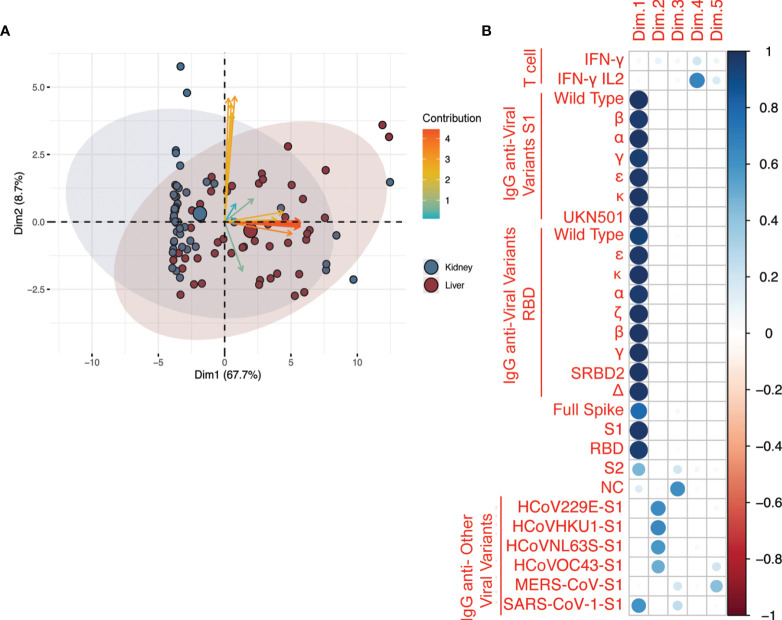
Figure 1.
Principal component analysis (PCA) of all the assays after second vaccination. (A) Analysis included antibodies against anti-SARS-CoV-2, anti-SARS-CoV-2 variants, and common coronaviruses, and IFN-γ and IL-2 T cell responses. The axes represent the two variables, among all those generated by PCA, that ranked first in terms of proportion of assay variability. The variables are represented by arrows; blue arrows = Fluorospot assays, orange arrows = anti-SARS-CoV-2 serological assays, yellow = serological assays for other coronaviruses. The angle between arrows represents the correlation between assays: assays with the same direction have a correlation coefficient of 1, those with opposite directions have a correlation coefficient of -1. Those that are perpendicular to each other have a correlation coefficient of 0. The patients are represented by data points with individual point size proportional to the quality of representation in the bi-dimensional plot. The plot is based on data after two vaccinations only (T2). The categorical variable type-of-solid-organ-transplantation (i.e. kidney vs liver) is added to the plot as a supplementary variable to visualize how the pattern of correlated variables and cloud of data points are distributed between types of solid organ transplantation. The colored ellipses represent the 95% confidence ellipses of the scatter around overall assay mean of each group (liver = blue or kidney = red). (B) Correlation between the five principal components extracted from PCA and the original variables (assays: T cell reactivity and IgG against SARS-CoV2 antigens and variants and other coronaviruses, including common coronaviruses: HCoV229E-S1, HCoVHKU1-S1, HCoVNL63S-S1, HCoVOC43-S1). As shown by the legend in the rightmost column, the correlation is represented by a color gradient as follows: blue for positive correlation, red for negative correlation, and white for no correlation. The correlation coefficient is represented by a circle, the diameter of which is proportional to the strength of the correlation. The variability explained by the principal components Dim.1 to Dim.5 was 67.7, 8.7, 5.6, 3.8, and 3.5%, respectively (not shown).

