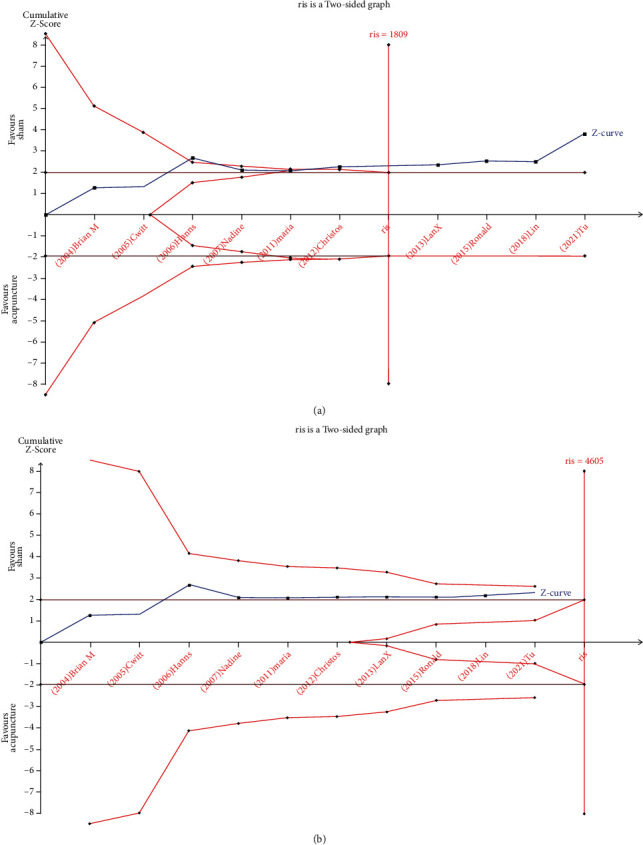
Figure 4.

TSA graph: pain: acupuncture vs. sham (a); function: acupuncture vs. sham (b).The blue curve represents the Z-curve, the red curves above and below represent trial sequential monitoring boundaries, the dashed red line represents the traditional level of statistical significance, and the red vertical line represents RIS value; the red lines on the sides closest to the horizontal line are boundaries for futility.
