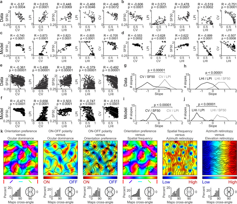
Fig. 9. Correlations among multiple stimulus parameters represented in the visual cortical map.
a Example correlations between multiple pairs of stimulus parameters measured in a single horizontal track of cat visual cortex (n = 35), including orientation selectivity measured as circular variance (CV), spatial resolution measured as the highest spatial frequency that generates half-maximum response (SF50), response strength to low spatial frequencies measured as low-pass index (LPI), and cortical clustering of orientation preference measured as a local homogeneity index (LHI). From left to right, the figure shows significant correlations between pairs of stimulus parameters. In all panels, r and p values were calculated with rank correlation (Matlab ‘corr’ function). b Example single-track correlations measured in a different animal (n = 47). c–d The model replicates single-track correlations as illustrated in two different simulations (c and d). The number of data points in each plot equals the average number of data points illustrated in (a–b). e Correlations from all single-track recordings obtained in multiple animals (n = 8 animals, 17 single tracks, 633 data points). f The model replicates the experimental correlations illustrated in (e), n = 20 single tracks, 800 data points). g Distribution of correlation slopes measured in cat visual cortex between CV and SF50 (black line), and CV and LPI (gray line). The CV/SF50 slopes were significantly more negative than the CV/LPI slopes. h Distribution of correlation slopes measured in cat visual cortex between LHI and LPI (black line) and between LHI and SF50 (gray line). The LHI/LPI slopes were significantly more negative than the LHI/SF50 slopes (n = 8 animals, 17 single tracks for all slope measures in g–h). i–j The model replicates the differences in slopes measured experimentally (n = 20 single tracks). Two-sided Wilcoxon tests for all slope comparisons. k Model simulations of the relations between paired combinations of maps. For each map combination, the top panel shows the pair of superimposed maps (color scale for the map listed first and contour plot for the second). The bottom panel shows the intersection angles between the two maps in a histogram (left) and a polar plot (right). Source data are provided as a Source Data file.

