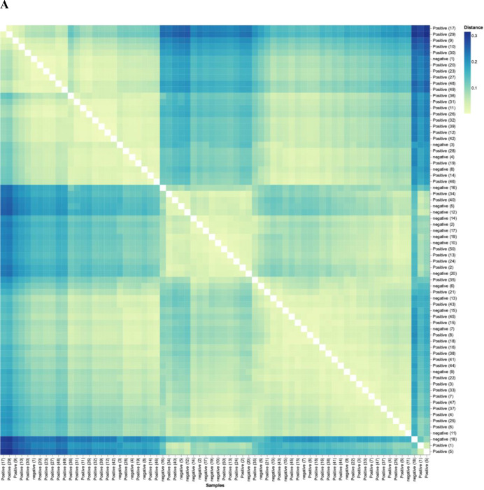
Figure 6.
SARS-CoV-2 positive patients’ microbiome is more similar to each other than to that of exposed controls. (A) Weighted UniFrac distance matrix of phylum level SARS-CoV-2 positive (n=50) and exposed negative control samples (n=20). Distance of microbiome differences increases with increasing blue colour intensity (see legend top right). The centre of the diagram consists of negative subjects on both axis and is yellow indicative of less distance (ie, lessdifference in microbiome). The central area of the left as well as central-top side of diagram, consists of negative subjects on one axis and positive on the other, and are darker blue, indicative of more distance (more difference in microbiome). (B) Principal component analysis of microbiota from SARS-CoV-2 positive (n=50) and exposed negative controls (n=20). Dots closer in distance are more similar in microbiome composition. Axes depict the per cent of variance explained by principal component (PC) 1 and 2. Plots are based on bacterial genera relative abundance profiles.

