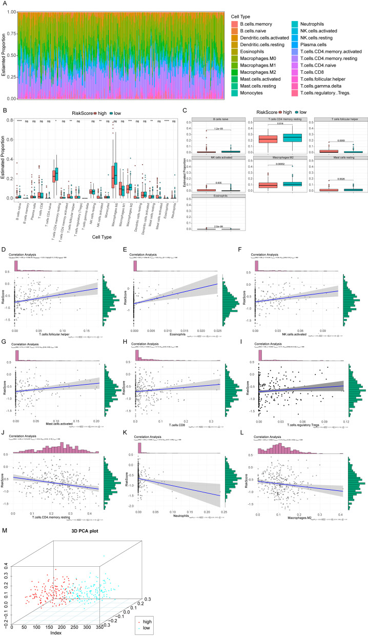
Fig. 6.
Immune infiltration between high- and low-risk groups. A The relative proportion of immune infiltrates in all patients. B Box plots of immune cell differences between high- and low-risk groups. The horizontal axis is the immune cells and the vertical axis is the relative infiltration proportion of immune cells. P value was calculated by wilcoxon method. (P > 0.05, *: P ≤ 0.05, **: P ≤ 0.01, ***: P ≤ 0.001, ****: P ≤ 0.0001). C Box plots of significantly different immune cells in the high- and low-risk groups. The horizontal axis and the vertical axis are the groups and the relative infiltration proportion of immune cells. P value was calculated by wilcoxon method. D–L The correlation diagrams of 9 immune cell and Risk Score. P value was calculated by t test and r value was calculated by the pearson correlation coefficient. M PCA three-dimensional clustering diagram, points of different colors represent different types of samples

