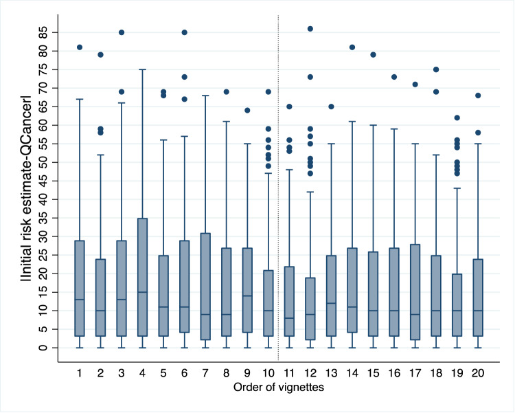
Fig. 1. A learning effect.
Box plot depicting the absolute difference between GPs’ initial risk estimates and QCancer scores by order of vignette presentation. The box plot shows the median, interquartile range, minimum and maximum values, and outliers for each vignette order. The dotted vertical line indicates the start of the second session (vignette order 11), when the pattern appears to stabilise, suggesting learning consolidation. n = 3140 data points (157 GPs x 20 vignettes). The source dataset for the Figure can be found in Supplementary Data 2.

