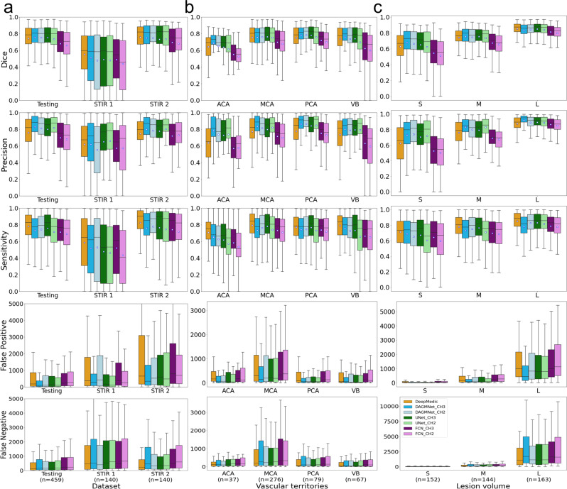
Fig. 3. Performance of all models (DeeMedic, DAGMNet, UNet, FCN).
The performance is shown according to testing dataset (a), vascular territory (b), and lesion volume (c), S: small, M: medium, L: large. In each Whisker’s boxplot, the white square indicates the average; the black trace indicates the median. The whisker is a representation of a multiple (1.5) of the interquartile range (IQR). False-positive and false-negative are in units of voxels, in the original image space. All the sub-figures share the same legend as in sub-figure (c).

