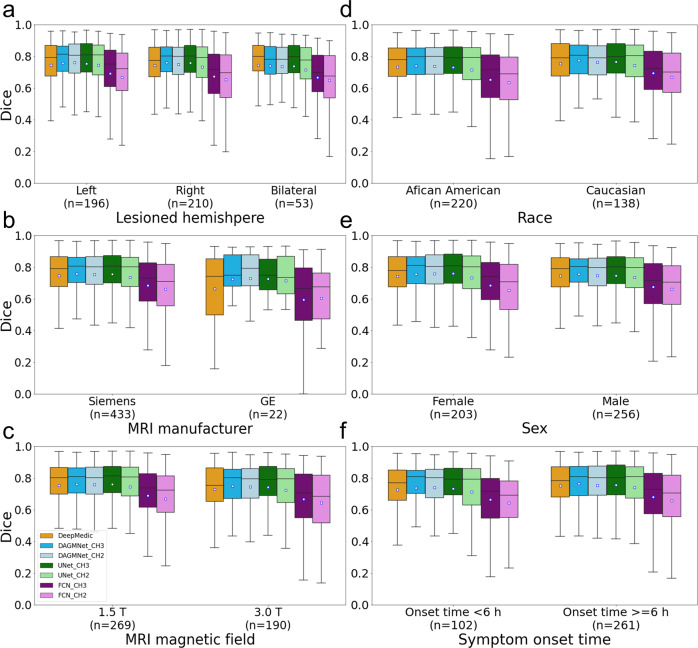
Fig. 5. Performance of all models (DeeMedic, DAGMNet, UNet, FCN) in the Testing dataset.
The performance is shown according to (a) lesion hemisphere, (b) scanner manufacturer, (c) MRI magnetic field, (d) patient’s race, (e) patient’s sex, and (f) symptom onset to MRI time. In each Whisker’s boxplot, the white square indicates the average; the black trace indicates the median. The whisker is a representation of a multiple (1.5) of the interquartile range (IQR). All the sub-figures share the same legends as sub-figure (c).

