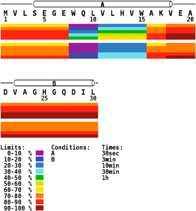
Figure 51.

Heat maps show deuterium uptake represented by different colors for each peptide across the primary sequence of the protein. Each bar shows the data for different time points, and the upper and lower set of bars represent two conditions of the protein. Reproduced with permission from ref (672). Copyright 2011 Elsevier.
