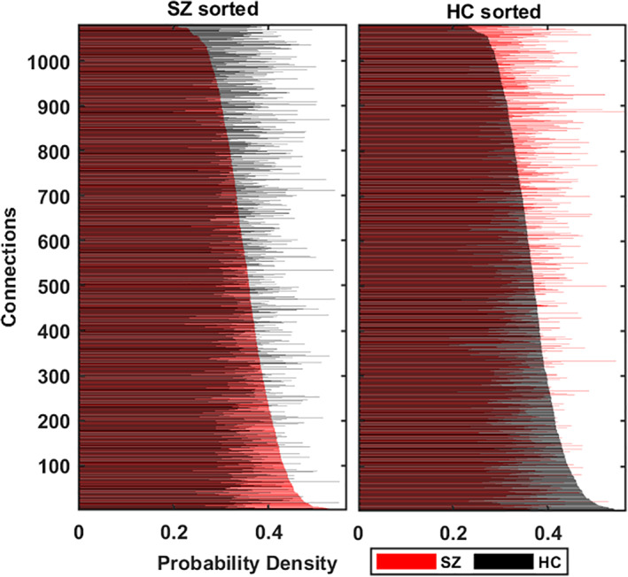
FIGURE 7.

Each connection's probability density (PD) demonstrates how frequently the statelets extracted from a connection appear in the group dynamic. Each connection has two density values: one per subject group. Blue demonstrates PD in controls (HC) and red in the patients (SZ). We sort the connections low to high according to their PD in the SZ group (left subplot), and HC sorts the right subplot. Y axis represents the order of the links after sorting, and X axis depicts their corresponding PD. We observe that the rank of connections differs in both subject's groups in terms of their PD; the PD difference is statistically significant and visually evident in the plot
