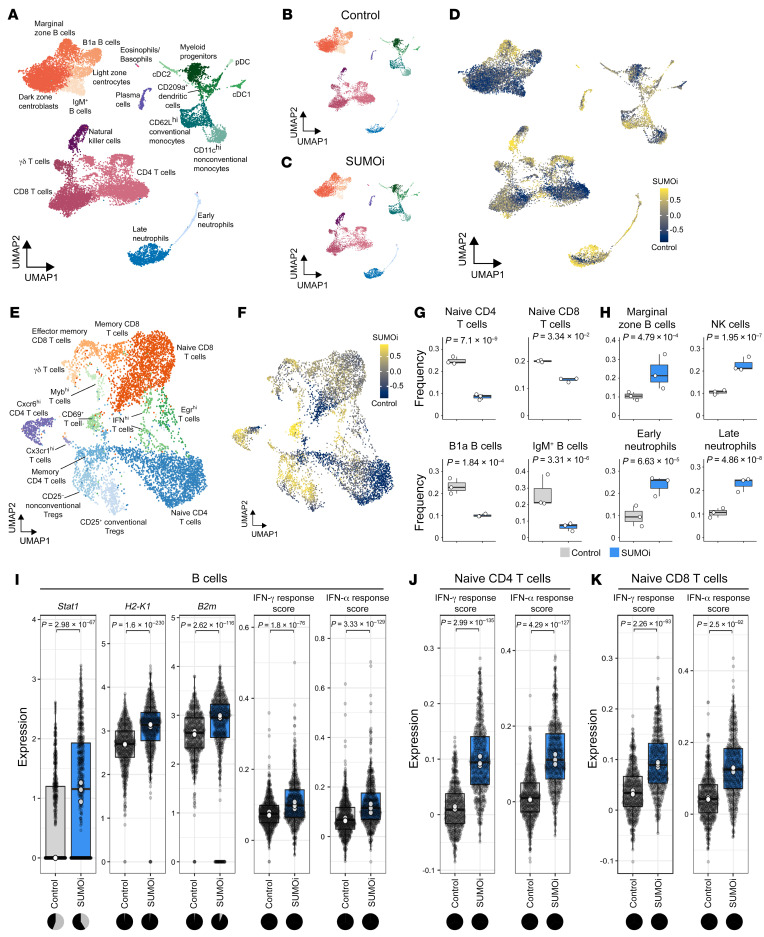
Figure 8. SUMOi globally alters the immune landscape.
(A) UMAP visualization of spleen scRNA-Seq data from control and SUMOi-treated mice. (B) UMAP visualization of spleen scRNA-Seq data from control mice (n = 3). (C) UMAP visualization of spleen scRNA-Seq data from SUMOi-treated mice (n = 3). (D) Detection of differentially abundant cell populations in the spleens of control and SUMOi-treated mice using DA-Seq (71). Cells are colored by the DA-Seq measure. Yellow indicates greater abundance after SUMOi treatment; dark blue indicates greater abundance in the control. (E) The T cell populations identified in A were separated and reclustered. The UMAP visualization shows T cells for both conditions. (F) Detection of differentially abundant T cell populations in control and SUMOi-treated mice with DA-Seq. Cells are colored by the DA-Seq measure. Yellow indicates greater abundance after SUMOi treatment; dark blue indicates greater abundance in control mice. (G and H) Differential abundance testing on mouse-wise pseudo-bulks (white dots, n = 3). Bar plots indicate the respective subpopulation frequencies stratified by condition. The center line of the box plot is the median. The box extends from the 25th to 75th percentiles. The whisker length is from minimum to maximum. Significance was determined using a negative binomial generalized linear model. (G) Significantly more abundant cell populations were detected in control mice. (H) Significantly more abundant cell populations were detected in SUMOi-treated mice. (I–K) Differential expression analysis in B cells (I), naive CD4+ T cells (J), and naive CD8+ T cells (K) of the genes of interest (normalized expression) and IFN response scores (arbitrary expression). Gray dots represent individual cells. White dots indicate the median per mouse-wise pseudo-bulk. The back line indicates the median across all cells. Wilcoxon’s rank-sum test was applied to determine significance. The adjusted P values (Bonferroni’s correction) are shown. The pie charts indicate the number of cells with normalized counts equal to 0 (gray) and normalized counts greater than 0 (black) for the respective genes and condition.

