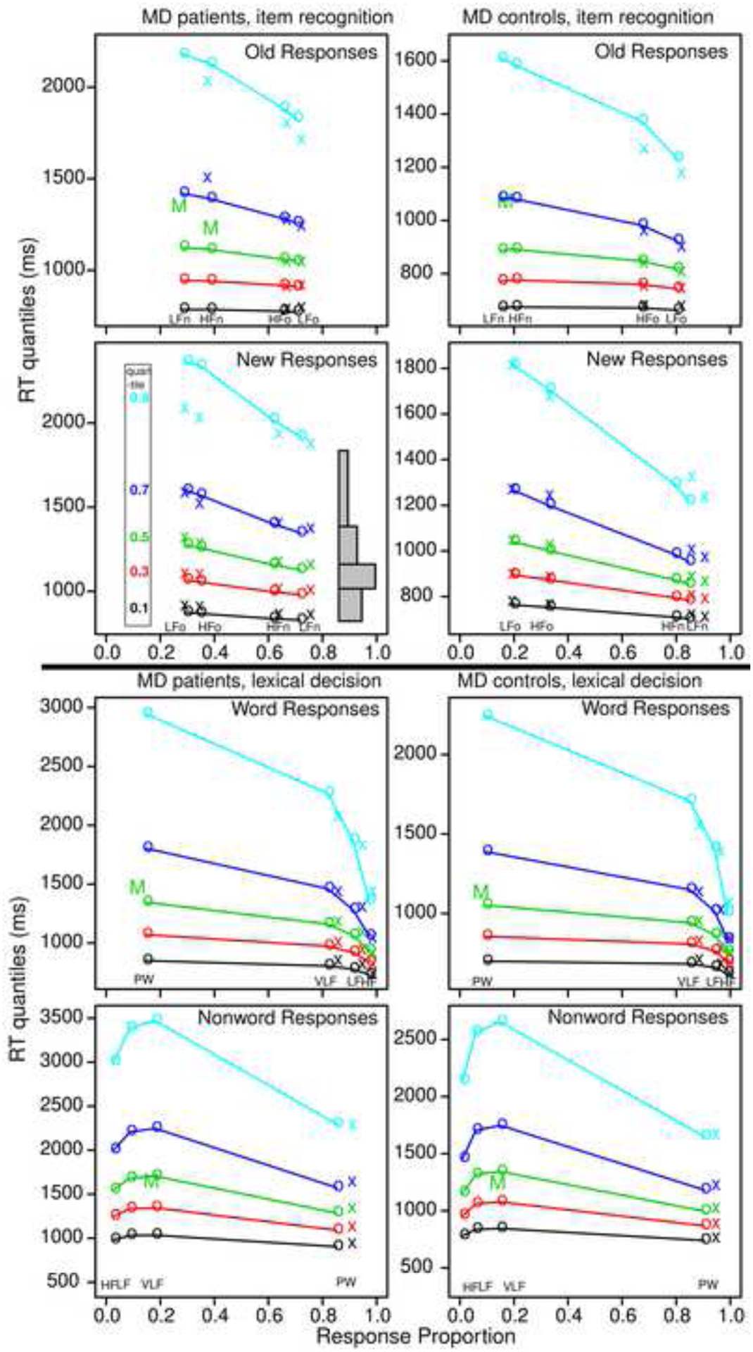
Figure 1.

Quantile probability plots for item recognition and lexical decision tasks for data and model predictions for MD patients and the MD control group averaged over subjects in the same way. The x’s are the data and the o’s are the predictions joined by the lines. The five lines stacked vertically above each other are the values predicted by the diffusion model for the 0.1, 0.3, 0.5, 0.7, and 0.9 quantile RTs as a function of response proportion for the conditions of the experiments. The quantiles are labeled on the left-hand side of the second left plot and equal-area rectangles drawn between the quantiles are shown on the right side of that plot (which represent RT distributions). The M’s in the plots show the median RT because some subjects did not have enough error responses to compute quantiles.
