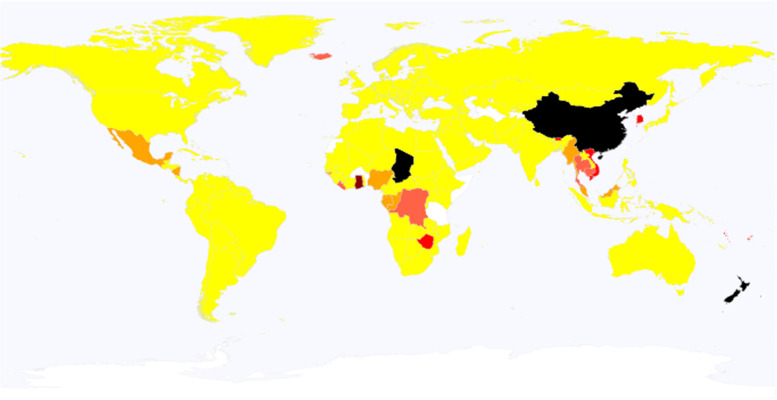
Fig. 2.
A global map showing the change in the number of COVID-19 cases. The change is based on the ratio of cases in the present week to those two weeks ago. In the map, the color for each nation depends upon the ratio; i.e., black, dark red, red, tomato, orange, and yellow represent 8 times or larger, 4 times or larger, twice or larger, 1.5 times or larger, equivalent or larger, lower than 1, respectively. Data for nations in white are unreported. This global map is based on a file obtained from Wikipedia (https://en.wikipedia.org/wiki/Wikipedia:Blank_maps), according to its Terms of Use

