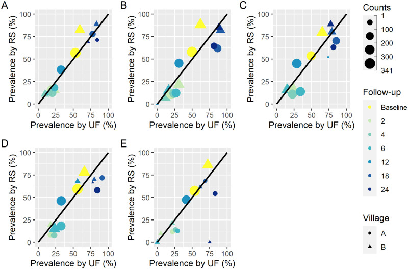
Fig 1. Comparison of prevalence by reagent strip (with trace negative) and urine filtration computed from raw data.
The dots and triangles represent the prevalence at baseline (before treatment) and follow-up (at 2, 4, 6, 12, 18, and 24 months post-treatment) for each study site and ‘Counts’ show the number of individuals tested. A shows the prevalence computed from individuals with complete data at day 1 regarding reagent strip and urine filtration tests. B, C, D, and E show the same for days 2, 3, 4, and 5, respectively.

