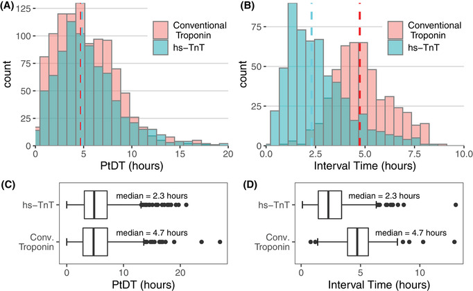
FIGURE 2.

Provider‐to‐decision time (PtDT) and serial troponin draw intervals before and after rapid algorithm and hs‐TnT implementation. Boxes A and B show histograms of PtDT and troponin interval time, respectively. The pink and teal bars represent the count of encounters in each bin for conventional and hs‐TnT cohorts, respectively; the shading is darker where the heights of the bars overlap. The dashed lines denote the medians. Note the axes are scaled differently between these 2 diagrams. Boxes C and D show the same data as box plots. The dark vertical line represents the median, and the limits of the box denote the interquartile range (IQR). The whiskers are set at 1.5*IQR above and below the 75th and 25th percentiles, respectively. Data beyond the end of the whiskers are plotted individually. The median PtDT was not significantly different between groups (P = 0.428); however, the median troponin draw interval did decrease significantly (P < 0.001).” Abbreviation: hs‐TnT, high‐sensitivity troponin T
