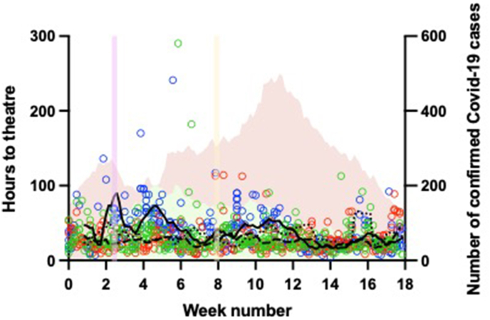
Fig. 4.
The length of time to theatre in hours by week of admission. Red circles represent individual patients admitted in 2019, blue circles individual patients in 2020 and green circles the second wave. The lines show seven-day rolling mean average, dashed line in 2019, solid line the first wave and dotted line for the second wave. Along the right y-axis the green shaded area show the number of confirmed COVID-19 cases within the hospital trust during the first wave, and red shaded area in the second wave.

