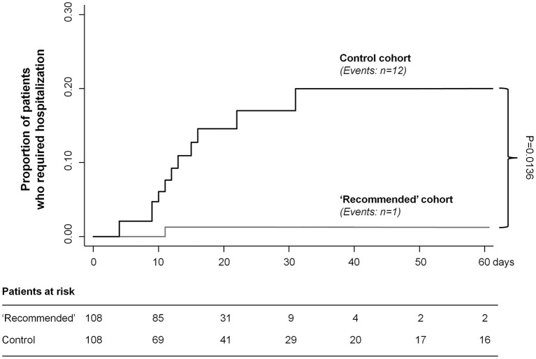
Figure 1.
Kaplan–Meier curves for the primary endpoint of hospital admission. Kaplan–Meier curves show the proportion of patients who required hospitalization in the two treatment cohorts. Gray line, “recommended algorithm” treatment cohort; black line, “control” cohort. P-value for treatment comparison was assessed by survival analysis for clustered data.

