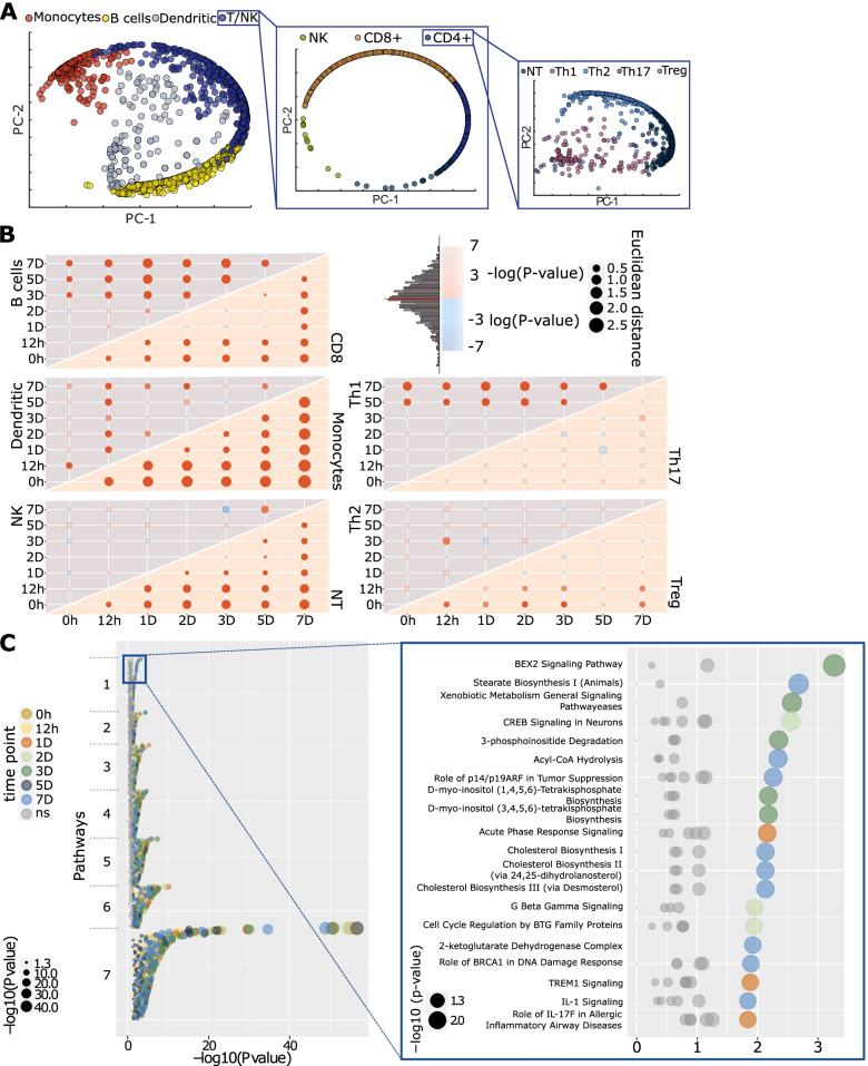
Fig. 3.
Diversity of gene expression across cell types and time points. A Principal component visualization of how each single-cell transcriptome correlated with cell type-specific bulk transcriptomes [33]. Only allergic patients’ cells stimulated with allergen are presented in the figure. Cells were classified into subsets in three main steps using RCA [33]. B Dot plot showing global transcriptomic shifts assessed with Euclidian distance (Ed) compared to a random distribution. Red and blue colors denote that empirical Ed was higher and lower than the random mean Ed, respectively. The size of the nodes represents empirical Ed. C Dot plot presenting all pathways enriched in DEGs at any time point in Treg cells. The colors of the dots represent different time points (not significant – ns, enrichments are shown with gray color), whereas their size denotes enrichment significance -log10(P-value)

