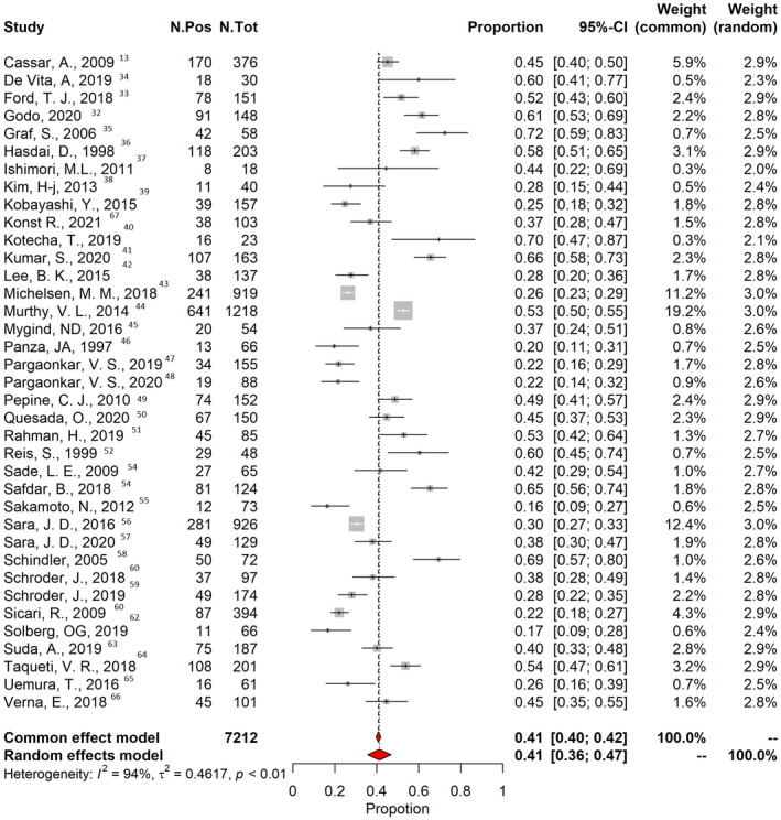
Figure 4. Prevalence of coronary microvascular dysfunction.

The vertical black line indicates the pooled averaged prevalence rate estimate, and the red diamond represents the overall estimated prevalence with 95% CI in a random‐effects model. Gray squares indicate weighted‐point estimates of incidence for each single study, with gray horizontal lines indicating 95% CI. I 2 indicates Higgins index of heterogeneity. Pos indicates positive; and Tot, total.
