
Figure 2: Model fits quantify heterogeneity in viral dynamics and discordance in genome shedding between nasal and saliva samples.
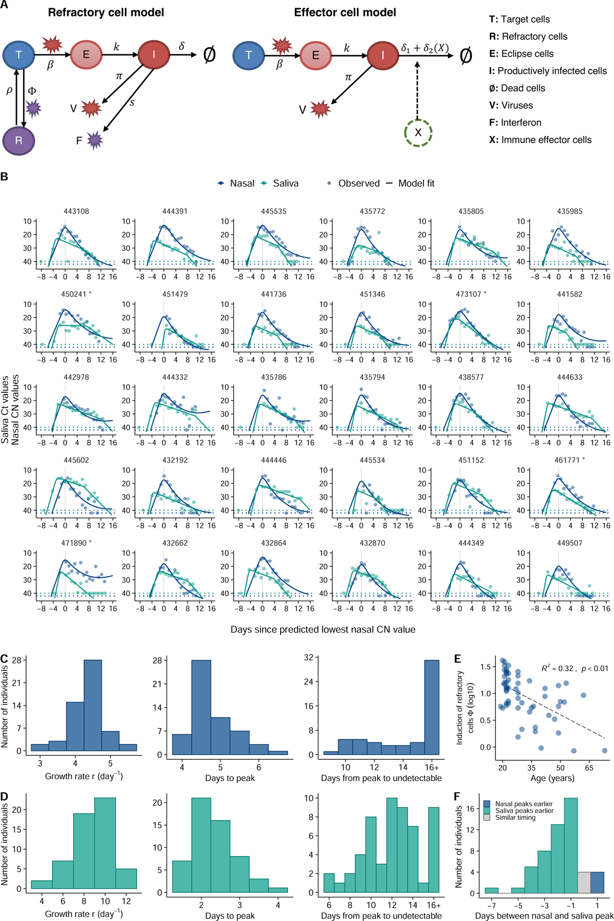
(A) Diagrams outlining structures of the refractory cell model and the immune effector cell model that best fit the nasal swab and saliva RTqPCR data, respectively. In the refractory cell model, target cells (T) are infected by viruses (V) at rate . Infected cells first become eclipse cells (E) and do not produce viruses; at rate , eclipse cells become productively infected cells (I) producing both viruses and interferon (F) at rate and , respectively. They die at rate . Binding of interferons with target cells induces an antiviral response that turns target cells into cells refractory to infection (R). The rate of induction of the antiviral response is . Refractory cells can revert to target cells at rate . In the effector cell model, we assume that over the course of infection, immune effector cells (X) that clear infected cells are activated and recruited. This leads to an increase in infected cell death rate from to . (B) Model fits to nasal sample (navy blue) and saliva (teal) RTqPCR results from the same subset of individuals shown in figure 1A. Includes last recorded negative saliva RTqPCR result prior to study enrollment. Dotted lines represent the limit of detection (LoD) for the RTqPCR assays. Dots on the dotted lines denote measurements under the LoD. (C, D) Distributions of the exponential viral growth rates, days from infection to peak viral genome load, and days from peak to undetectable viral genome loads predicted by the refractory cell model (nasal data; panel C) and the immune effector model (saliva data; panel D) across 56 individuals in this cohort. (E) Association between age and the estimated strength of the antiviral immune response (Φ) based on nasal sample data. The Y axis is shown on a log 10 scale. Associations are examined using a standard linear regression analysis. The R-squared value and the p-value are reported. (F) Distribution of the differences in the estimated times of peak viral genome loads between the saliva and nasal samples. Bars colored teal and navy blue represent estimated saliva peaks that occur at least 0.5 day earlier and later than nasal samples, respectively. The gray bar indicates the number of individuals that have similar timing in the peaks.