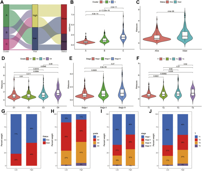
FIGURE 11.
Correlation analysis between risk score and clinical features. (A) Distribution of different HCC clusters (A, B, and C) and risk group. (B) Violin plot showing risk score in different HCC subtypes. (C) Violin plot showing risk score in groups with alive or dead status. (D) Violin plot showing risk score in groups with difference grades. (E) Violin plot showing risk score in groups with differences in tumor stages. (F) Violin plot showing risk score in groups with difference in TNM stages. Violin plot showing risk score in groups with alive or dead status. (G) Fraction of patients with alive or dead status in low- or high-risk score groups. Alive vs dead: 77 vs 23% in the low-risk score group and 56 vs 44% in the high-risk score group. (H) Fraction of patients with difference grades in low- or high-risk score groups. G1 vs G2 vs G3 vs G4: 16 vs 55% vs 27 vs 2% in the low-risk score group, 11 vs 43% vs 41 vs 5% in the high-risk score group. (I) Fraction of patients with difference in tumor stages in low- or high-risk score groups. Stage I vs stage II vs stage III vs stage IV: 60 vs 21% vs 18 vs 2% in the low-risk score group, and 40 vs 28% vs 31 vs 1% in the high-risk score group. (J) Fraction of patients with difference in TNM stages in low- or high-risk score groups. T1 vs T2 vs T3 vs T4: 60 vs 21% vs 17 vs 2% in the low-risk score group, 40 vs 29% vs 27 vs 4% in the high-risk score group.

