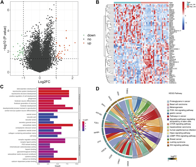
FIGURE 5.
Functional enrichment analysis. (A) Volcano plot showing the DEGs of the risk score (high vs. low). Green: downregulated (Down), red: upregulated (Up), black: unchanged (no). (B) Heatmap based on 61 DEGs that were differentially expressed between high- and low-risk score samples. Each column represents a sample, and each row represents the mRNA level. Red indicates that the gene is upregulated, and green indicates downregulated genes. (C) Top 10 Gene Ontology terms enriched by the DEGs. (D) KEGG enrichment analysis of DEGs. The left side of the circle is the gene, and the right side is the pathway. Different colors represent different pathways, and the color of each pathway is annotated in right of the circle. If the gene belongs to a pathway, there will be a line between the gene and the pathway.

