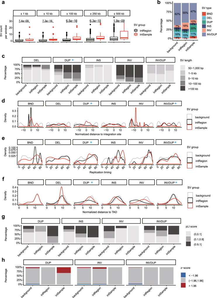
Fig. 7. The relationship between structural variations and HPV integration.
a SV counts in windows of different lengths compared between intRegion (n = 1232) and intSample (n = 88). Data are shown in boxplots. The thick line in the box is median and box spans from Q1 (25th percentile) to Q3 (75th percentile). The whiskers extend to the most extreme observation within 1.5 times the interquartile range (Q3–Q1) from the nearest quartile. b The relative proportion of SV types in different regions. c The SV size distribution of each SV type in different regions. d Distribution of normalized distance from SVs to nearest HPV integration sites. e Distribution of SV replication timing of each SV type in different regions. f Distribution of normalized distance from SVs to nearest TAD. g The distribution of SV pLI score in different regions for each SV type. h The composition of SV expression changes in different regions for each SV type. BND, breakend; DEL, deletion; DUP, duplication; INS, insertion; INV, inversion; INVDUP, inverted duplication. In each genomic feature, the SV types that have distinct distribution deviations between intSample and intRegion are highlighted with a blue arrow or asterisk. For each feature in every displayed SV type, the statistical significance of the difference between intSample and intRegion was summarized in Supplementary Table 6. Source data are provided as a Source Data file.

