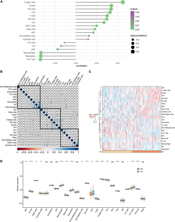
FIGURE 8.
Immune infiltration analysis. (A) The lollipop plot of the correlation between the risk score and immune infiltration. (B) The heatmap of the correlations between different immune cells. (C) The heatmap of the immune infiltration in high and low-risk groups. (D) The boxplot of the immune infiltration in high and low-risk groups. *P < 0.05, **P < 0.01, ***P < 0.001. ****P < 0.0001; ns, no significance.

