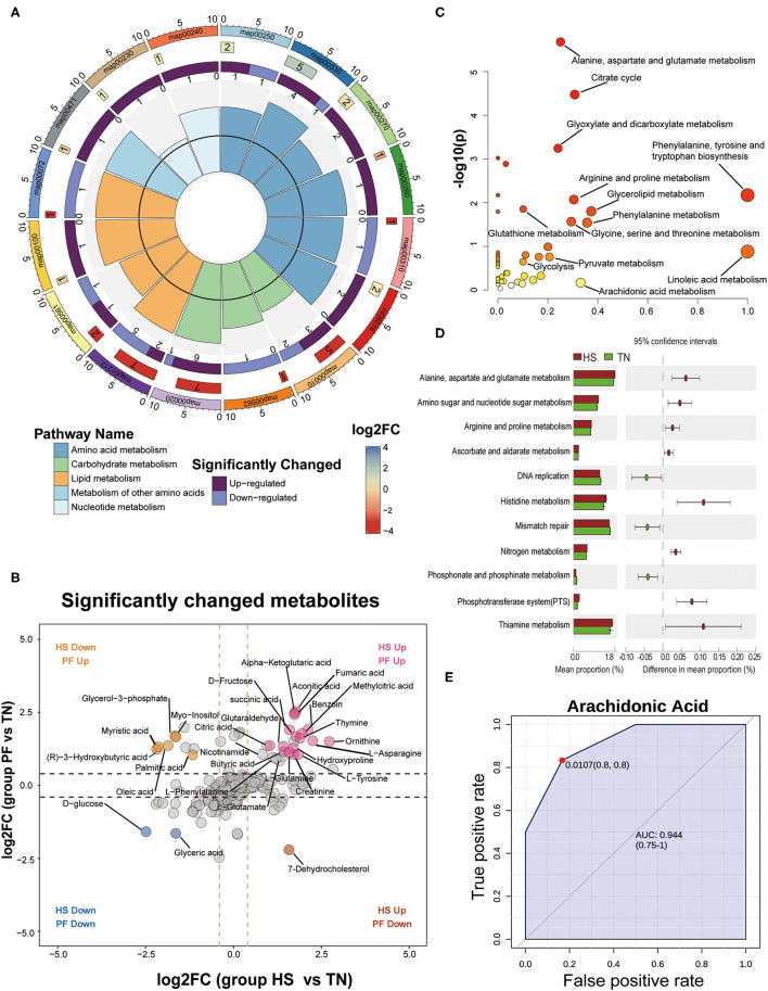
Figure 7.
Detection and identification of differential metabolites and further classification into different metabolic pathways by KEGG analysis. (A) An enrichment cycle diagram (HS vs. TN) including four circles from the outside to the inside, representing a KO identifier, the number of differential metabolites in the categories, the number of upregulated and downregulated metabolites, and the max VIP value of differential metabolites in each category, respectively. (B) Scatterplot comparing the serum metabolites expression pattern between different groups (PF vs. TN at y-axis; HS vs. TN at x-axis). The significant changed metabolites were labeled in colors (|log 2-fold change| ≥ 1 and p < 0.01). (C) The bubble plots of significantly different metabolites enriched pathways between HS and TN groups. The abscissa and bubble size of the bubble represent the importance of the metabolic pathways in the topology analysis, and the ordinate and bubble color (from white to yellow to red) denote the significant level of the metabolic pathway through enrichment analysis. (D) Functional analysis of the cecal microbiota using PICRUSt (Level 3). The abundances of KEGG categories were significantly changed between HS and TN on Day 21. (E) A representative image of ROC curve analysis for differential metabolites in serum between HS and TN groups after 21-day heat exposure. More image of ROC curve analysis for differential metabolites among the three experimental groups is available in Supplementary Figure S7.

