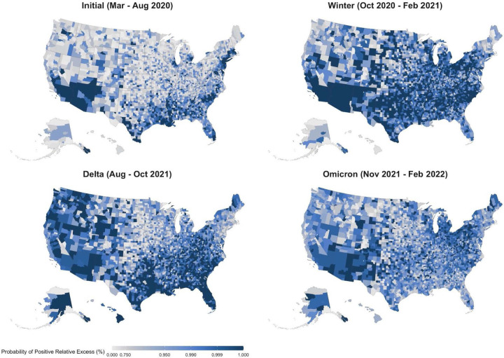
Figure 2.
Probability of Positive Excess Mortality across U.S. Counties during 4 Mortality Peaks, March 2020 - February 2022
Notes: Each county in the map is colored according to the posterior probability that the observed death count is higher than the expected one. We highlight counties where the probability of positive excess mortality is higher than 0.75. The four maps refer to the four peak periods of the pandemic, months of particularly high excess mortality.

