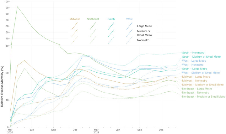
Figure 5.
Rolling Cumulative Relative Excess Mortality by Census Region and Metro Category, March 2020 - February 2022
Notes: Each line represents the rolling cumulative excess mortality for one combination metropolitan/nonmetropolitan area categories and one census region. “Large Metro” includes large central and large fringe metropolitan areas. Each census region is represented by a different line color: light brown for Midwest, green for Northeast, aquamarine for South, and light blue for West. Each metropolitan category is represented by a different line type: solid for Large Metro, dashed for Medium or Small Metro, and dotted for Nonmetro. The y-axis for relative excess mortality above 30% is compressed vertically. Rolling cumulative relative excess mortality is calculated as the sum of excess deaths divided by the sum of expected deaths for all months from March, 2020, through a given month. For example, values for February, 2022, reflect total excess deaths for 24 months of the pandemic, from March, 2020, through February, 2022. Decreasing cumulative relative excess mortality indicates months with relative excess mortality below-average to date, for a given combination of census region and metro category. Increasing cumulative relative excess mortality indicates months with relative excess mortality above-average to date, for a given combination of census region and metro category.

