Figure 6.
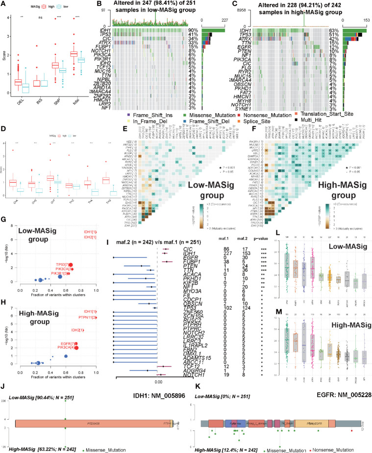
Comparisons of somatic mutations under different MASig. (A) The differences in the fraction of deletion (DEL), insertion (INS), single-nucleotide polymorphism (SNP), and total variance between high and low MASig subgroups. (B, C) Waterfall plots about the mutation distribution of the top 20 most frequently mutated genes between low (B) and high (C) MASig subgroups. (D) Differences in the fraction of six types of single-nucleotide variants (SNV) between high and low MASig subgroups. (E, F) The correlation heatmaps about correlations of 30 top mutated genes between low (E) and high (F) MASig subgroups. The color and symbol in each square represented the statistical significance of the exclusive or co-occurrence for each pair of genes. (G, H) Driver genes of the low (G) and high (H) MASig subgroups. The horizontal line of the box plot represented the median values. (I) The forest plot about the differential mutation profiles of 30 most frequently mutated genes between high and low MASig subgroups. (J, K) The lollipop plots displayed the differential distribution of mutation loci and types for IDH1 (J) and EGFR (K). In the box plots and the forest plot, p<0.05 was indicated by “*”, p<0.01 was indicated by “**”, p<0.001 was indicated by “***”, and no significant was indicated by ns.

